Overview: Optimized the navigation of Discover Global Network’s website to modernize the interface and ensure users could locate topics of interest efficiently and intuitively.

Objectives: To use data and build a cohesive and scalable information architecture that would ensure users were efficiently finding topics of interest and update the design to be modern and intuitive.
My Role: UX Management, UX Test Design, UX Research, UX Strategy, Interaction Design, UI Design, UX Writing
UX Research
We laid the groundwork for overhauling the mega-menu design by conducting several research activities, from which we established benchmarks and gained a thorough understanding of the problem space.
Project Background
My team had been aware that the navigation system for Discover Global Network (DGN) was problematic, but proposals to fix it had been met with resistance from our day-to-day clients.
Initially, our marching orders were to focus solely on improving the navigational subtitles (the text that appeared underneath a page’s title in the navigation). However, we felt this would at best be a band-aid fix, and that it would not address any of the navigation’s more severe usability issues. So, we began to make a case for redesigning the entire navigation, soup to nuts.
Competitive Research
We started by analyzing websites of other payment networks and B2B brands to understand how competitors approached navigation, usability, and content organization. This helped us to understand and articulate clear opportunity areas we could focus on for immediate improvement.



User Interviews
We interviewed 30 participants from key groups, including FinTech professionals, merchants, acquirers, card issuers, and developers across the United States, Canada, the United Kingdom, India, and Singapore.
Activities:
•
Developed a test plan.
•
Conducted tests with 30 users via a third-party testing partner.
•
Documented feedback using the 'Rose, Bud, Thorn' framework for taking notes.
•
Synthesized data by creating cluster maps.
•
Compiled feedback and insights into a findings report.
Key Research Findings
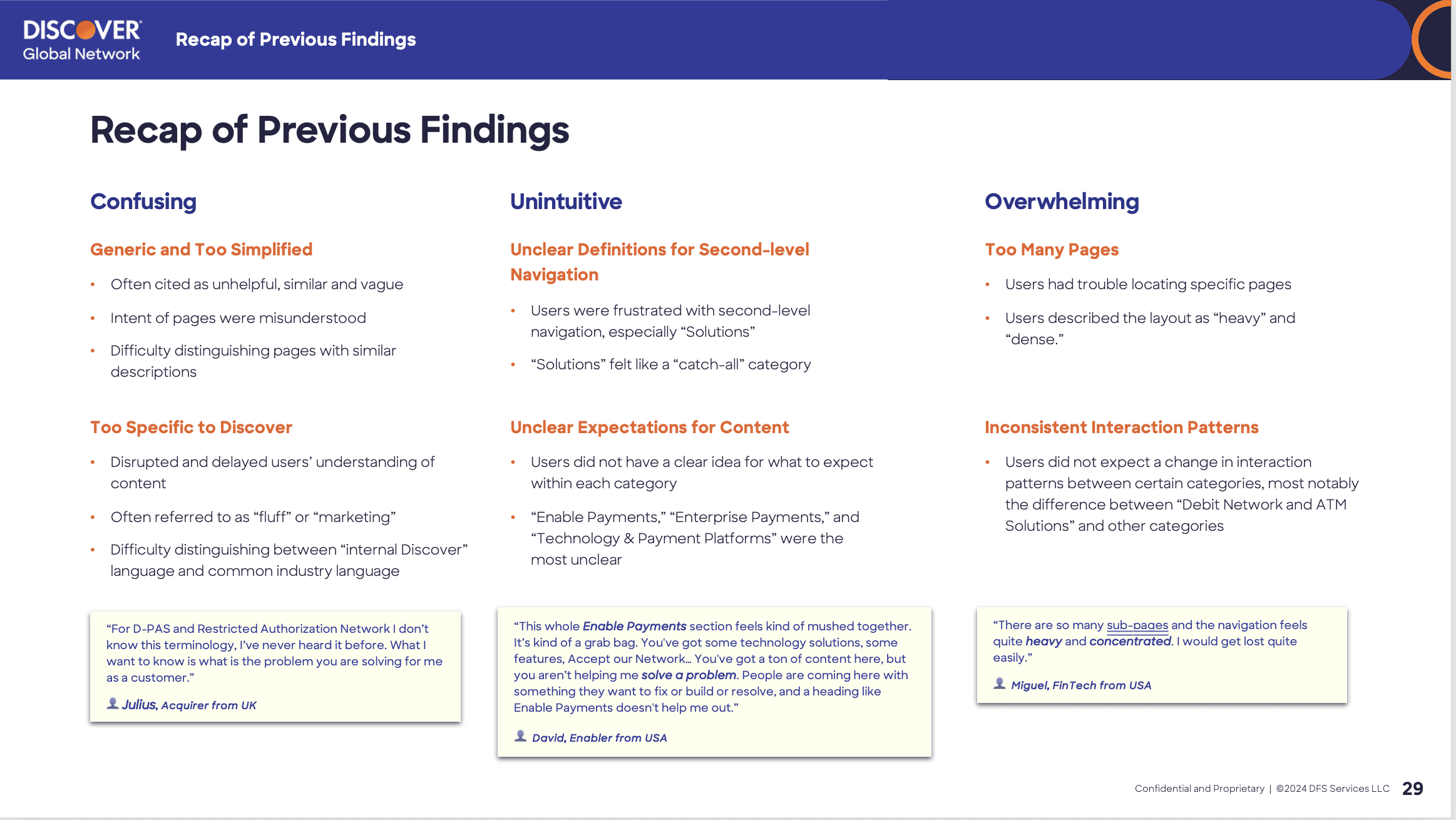
Descriptions Were Ignored
We found that users often skipped reading the descriptions below the page titles, citing them as too generic, overly specific, irrelevant, and stating the descriptions made the navigation feel dense.
Users Did Not Understand Audiences
Many users struggled to identify their audience type, or fell into multiple categories of audience type, often relying on inconsistent, localized terminology.
Solutions Sub-Categories Were Unclear
Primary categories seemed clear, but secondary categories, especially under 'Solutions,' frequently confused and frustrated participants.
Navigation Structure Was Overwhelming
Users described the navigation as overwhelming and heavy, with an outdated look and inconsistent patterns that caused significant issues, especially on smaller devices.
Information Architecture
Once the initial qualitative research was complete, we proposed conducting quantitative testing to gather more concrete data we could use to engineer solutions. These tests helped us determine how best to group and categorize information and gave us the hard data needed to justify proposals for reorganization and category creation.
Card Sorting
First, my team conducted open and closed card-sorting tests to discover how users grouped topics and what labels they used to identify groups; this revealed trends and inconsistencies in how information was perceived and organized. I designed and built the tests and oversaw the synthesis and creation of the findings report.


Research Findings
Closed Sorting Test
Less than 44% of participants correctly placed a majority of pages into existing categories, indicating users may be struggling to understand page titles and descriptions.
Open Sorting Test
33% of participants grouped pages into overly broad categories like Card-Enablement, Issuing, or Commerce. This reinforced the conclusion from the closed test.
Category Development
Though we concluded that the existing page titles were likely the main source of confusion for users, the client was loath to change any titles, especially when the titles were also product names.
However, my team believed that by creating better sub-categories, we could alleviate some of this confusion, so we proposed new sub-categories that would clarify relationships between topics and guide users more effectively.

High-Interest Topics
Because broad, catch-all categories with lots of pages overwhelmed users, we proposed creating smaller groups with plain-language category titles. This was informed strongly by the findings from our card sorting tests.
Desired Action
During qualitative tests users were observed struggling to make decisions, which prompted us to explore an action-oriented nomenclature that could guide users quickly to topics relevant to their current role. This would also be a workaround to labeling categories by audience type, which tested poorly during earlier testing.
Benefit to User
During interviews, several users said they did not understand what DGN could do to help them solve everyday challenges, so we decided to address these concerns head-on by crafting new categories that spoke directly to business goals.

Tree-Testing
Next, we conducted a tree-test to assess how effectively our redesigned categories performed against each other, and against the existing navigation.
Research Findings:
•
Across all tests, participants struggled to locate target content, succeeding only 14% of the time, again revealing significant challenges in the navigation structure.
•
Page titles with product brand names were frequently misinterpreted, leading users down incorrect paths and causing users to give up and not complete the test.
•
The three primary categories (Our Network, Solutions, Resources) were too vague to guide users effectively, with participants equally likely to choose any of the three when starting most tasks.
Conclusions:
Despite the inconclusive results, the test inadvertently validated all three of our proposals because all three information architectures performed equally and outperformed the existing navigation.
Moreover, the findings finally persuaded the client to address problematic page titles, which were previously verboten.
Next Steps
Following the tree test, we proposed a roadmap for refining page labels, starting with high-priority pages. However the project is currently paused, pending the merger between Discover and CapitalOne.

Interaction & UI Design
As the information architecture was being tested, my team proceeded to design several flexible navigation options that could house any proposed information architectures.
Wireframe Exploration
I directed the creation of three design directions that addressed usability challenges.
•
Guided Discovery: An evolution of the existing design with modifications and improvements to enhance clarity while retaining a modicum of familiarity.
•
At-a-Glance: This version removed the interaction cost for subcategories, presenting content right away and reducing the amount of friction.
•
Flexible Wayfinding: By only showing priority pages and hiding lower-value content from the initial view, we reduced the cognitive load of users.


High-Fidelity Prototypes
The client appreciated all three proposals so much that they decided to feature them in their 2024 report to investors, so we created fully interactive prototypes to illustrate how the navigation, interactions, and visual design would come to life.


Key Takeaways:
Turning a Ship Takes a Long Time
Large-scale projects often require patience and persistence, but by taking incremental, data-informed steps, we aligned with stakeholders and successfully guided the project toward long-term success instead of continuing to focus on band-aid patches.
Bottom-Up Category Creation
Even the most intuitive category labels cannot overcome poorly labeled content. Refining page titles to align with user expectations proved crucial and impeded the ability to create a navigational structure that was informative and intuitive.
Additional Credits
Agency - Grey
UX/CX Director - Emmanuel Bakarema
Senior UX Consultant - Ruzanna Rozman
Strategy Director - Stephanie O'Brien
Strategy Director - Nathan Zwilling
Copy Director - Katy Gerry
Art Director - Mitch Beckman
Account Director - Emily Sutton
Account Supervisor - Shannon Hehman
Senior Project Manager - Tommy Boeing